
Your Course Platform Hosts. It Does Not Sell.
Somebody sees your ad. They feel something. They click.
They land on a wall of video thumbnails, a price, and a subscribe button.
No context for what they just saw. No explanation of what this is or who it is for. No path from interest to decision. The platform did exactly what it was built to do, and the sale did not happen.
What does a course platform actually do?
It hosts a product and it takes payment. Both well, usually.
What it gives you at the front is a browse page: a catalog, a price, a button. That works when somebody already knows what they want and has come looking for it. An existing member, a referral, somebody who searched your name.
Cold traffic from an ad is the opposite of that person. They arrived on a feeling, not a decision, and a catalog asks them to work out for themselves what this is and whether it is for them.
That gap is not a flaw in the platform. Hosting and selling are different jobs. The mistake is assuming that because the platform has a checkout, the selling is handled. It is not. The platform provides the destination. The path to it is a separate build, and on most membership businesses it does not exist.
What does building a funnel in front of a platform look like?
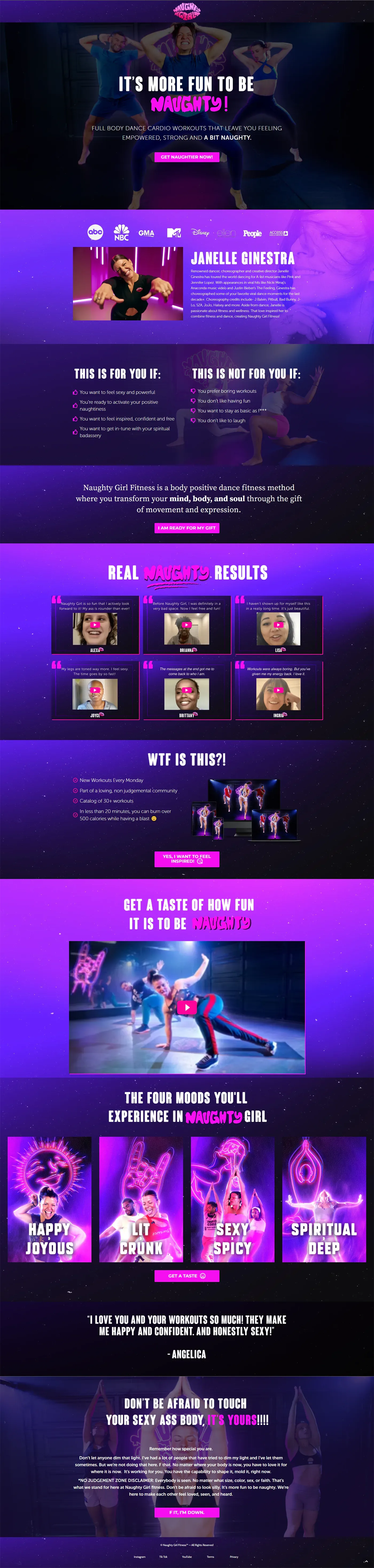
Naughty Girl Fitness is a dance fitness membership founded by choreographer Janelle Ginestra, hosted on Vimeo OTT and selling at $14.44 a month or $154.99 a year. Paid ads were running and bringing cold traffic straight to the platform.
Three things were built between the ads and the membership.
A sales page and thank you page, on Dropfunnels, sitting in front of the Vimeo OTT catalog. Somebody arriving from an ad now met a page that explained the method, showed who it was for, framed the offer and asked for one decision.
A seven day free trial. On a product where the value is experiential, asking somebody to commit to a subscription before they have taken a single class is asking for the decision before the thing that creates the decision has happened. The trial is still running on the site today.
Email automation across the trial window, integrating Dropfunnels with Mailchimp. This is the part that makes a trial work rather than leak.
The client reported a 20 to 25% conversion improvement and an increase in lifetime value. Those figures come from them rather than from an account I could see, which is why there is no dashboard behind them.
Why do free trials fail?
Because nothing happens during them.
A free trial with no follow up produces a lot of signups and a lot of quiet cancellations. The signup felt like progress, and then seven days passed in which the business did nothing and the user did nothing, and the trial expired.
The sequence during the trial has one job, and on a movement product it is unusually clear: get people into a class in the first days. A trial user who has actually danced converts. A trial user who has not does not, and no amount of persuasion on day six changes that.
The general version applies to every trial. Whatever the moment is where somebody experiences the value, the sequence exists to get them there quickly, not to sell them at the end.
Kajabi or Kartra, and why not just pick one?

Sometimes the honest answer is to use two platforms, and that decision needs defending rather than assuming.
On a food safety training business, the build ran Kajabi for the courses and Kartra for the funnels. That split came from a specific limitation in each.
Kajabi's page design is constrained. For a course platform that is a reasonable trade, and it means the sales pages you can build on it are limited in ways that matter when the page has to do the selling.
Kartra's course hosting is poor. Good funnels, weak delivery. Running courses there would have solved a page design problem by creating a worse student experience problem.
So each platform does the half it is genuinely better at. That costs two subscriptions and an integration, and it buys pages that convert and a course experience that holds up. Choosing one tool for everything is the default because it is simpler to administer, and simpler to administer is not the same as better.
What about the experience after somebody buys?
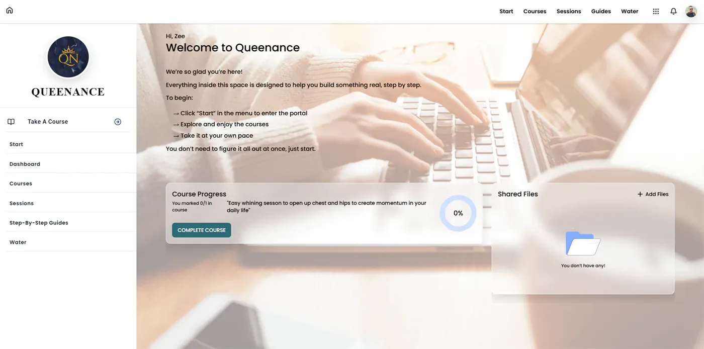
Almost all funnel work stops at the payment, and the member area gets whatever the platform shipped with.
That gap is where refunds are decided and where the decision about whether to buy the next thing quietly gets made. Somebody who has just paid is at their most attentive and most nervous, and what they see in the first minute either confirms the decision or starts undermining it.
Some of that is a platform limit rather than a design choice. GoHighLevel's client portal cannot be styled out of the box: not the sidebar, not the header, not the brand colors. Whatever it looks like is what every GoHighLevel portal looks like.
On one course business, custom code overrode all of it, and added sidebar navigation the platform does not support. Which raises a question worth carrying into any platform decision: when your software tells you something is not possible, has anybody checked whether that is true? Most platform limits are defaults rather than walls.
How do I know if my platform is costing me sales?
Three questions, and the third one gives you a number.
1. When somebody clicks your ad, do they land on a page built to sell, or on your platform's default catalog?
Click your own ad and see where you end up.
2. Does your offer ask for commitment before the person has experienced anything?
On experiential products this is the most common reason a good offer converts badly.
3. If you run a free trial, what percentage of trial users take an action in the first three days?
If nobody is measuring it, that is the number your trial is quietly failing on.
Somebody Has To Build The Deciding Part
The platform did its job. It hosted the product and it was ready to take the money.
Nobody built the part where somebody decides to give it.
If your ads point at a platform page, that gap is worth looking at before the ad budget moves.