
Two Products, Ranked, So Nobody Has To Choose Blind
Jinfiniti Precision Medicine
Client reported a 12% conversion improvement over the same products on the website
- Client
- Jinfiniti Precision Medicine
- Vertical
- Health and wellness
- Offer
- NAD products
- Products
- NAD Optimization Starter Kit and Vitality Boost
- Built
- One long form funnel carrying both products, ranked rather than listed
- Platform
- Dropfunnels
- Result
- Client reported a 12% conversion improvement over the same products on the website
- My role
- Direct client. Funnel design and build
Everything on one site, and no way to choose
Jinfiniti Precision Medicine sells NAD supplements. They had a website, and every product sat on it.
Stacked, is the accurate word. All of them present, none of them explained in relation to the others, and no path from arriving to deciding. Traffic landed and had to work out for itself which product applied to them.
That is a specific failure and it is not a design failure. Each product page was fine. What was missing was the layer above them: the thing that tells somebody which of these is for you and why.
A visitor who cannot answer that does not pick carefully. They leave, and the business reads it as a traffic problem.
The category makes it harder. NAD supplements attract an informed buyer, often already reading research, inclined to check what they are told. That rules out most of what supplement marketing normally does. The urgency, the transformation language, the before and after framing. Aim that at somebody who reads studies and you lose them on the first screen, because the tone tells them what kind of company this is before the content does.
So the answer could not be a louder page. It had to be a clearer path.
What I built
- One long form page, built on Dropfunnels
Not two funnels. Two separate funnels would have recreated the original problem in a new place, because somebody still has to decide which one to enter.
- A first person story rather than a product pitch
The page opens with somebody describing their own energy decline, their NAD test result, and what changed. Not the company talking about its supplement. A person talking about their own numbers.
That framing does something a product page cannot. It gives the reader somebody to be, and it makes the product a consequence of a story rather than the subject of one.
- Evidence placed where a skeptic reaches for it
Test results before and after, with dates and actual figures. Independent scientific authority quoted, including researchers the target reader already trusts. Press logos near the top.
This is the part most supplement pages get backwards. They lead with the claim and put the evidence in small print. For a buyer who reads studies, the evidence has to arrive before the ask, or the ask reads as marketing.
- The science section, explained rather than asserted
What NAD does, why levels decline with age, and what that means physically. A chart showing the decline curve. Enough that a reader understands the mechanism before being shown a product that addresses it.
Somebody who understands why a thing works does not need to be persuaded that it works.
- Two products, ranked
Both offers presented side by side and labeled: the Starter Kit as Best, the Vitality Boost as Better. Each with its value, its discounted price and its own order button.
This is the piece that fixed the original problem. The website presented products as equals and left the visitor to work out which applied to them. The funnel ranks them. A ranked pair is a much smaller decision than an unranked one, because the reader is choosing a level rather than researching a category.
- Guarantees and a discount, placed after the decision
Efficacy guarantee, a 60 day money back guarantee, and a discount code. All of it below the offers rather than above, so they answer a hesitation somebody already has rather than creating one they did not.
The page that was built
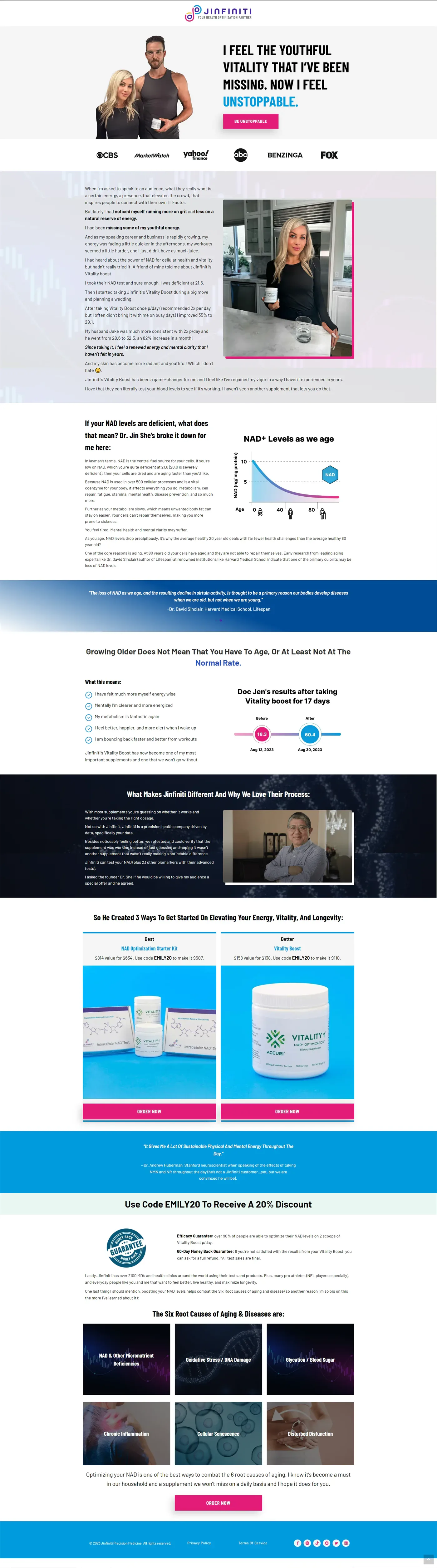
Sales page
What it produced
The client reported a 12% improvement in conversion against the same products sold on their regular website.
Same products, same prices, same audience. What changed was that somebody arriving no longer had to work out which product applied to them.
On the source of that figure. It came from the client rather than from an account I could see, so it is stated as their report. There is no dashboard behind it and this page does not pretend otherwise.
What the number describes is worth being precise about. It is not a lift from better copy or a stronger claim. It is what happened when the decision got easier: the science explained first, the evidence placed before the ask, and two products ranked rather than listed.
The buyer did not need convincing that NAD supplements work. They needed to understand the mechanism and then be told which of two options applied to them. The website did neither.
What applies to a business like yours
Three questions worth asking if your buyer is informed and skeptical:
- Would somebody who knows your subject find anything on your page that makes them wince?
- Is your evidence where a reader reaches for it, or further down than the claim it supports?
- Does your page tone signal the same seriousness as your product?
The first question is best answered by an expert who does not work for you.
Services behind this project
The thinking behind this project: Explaining is not selling, and your sales page knows the difference
Write For The Person Who Will Check
Marketing to somebody who checks is a constraint on tone before it is a constraint on claims, and most supplement pages fail at the tone.